
Kion hides
its best number
By most agency standards this is a good main image: compliant, legible, unmistakably branded. What it does not do is carry a single reason to click at the size the click actually happens. We read it against every winning main on its shelf, then rebuilt it to compete.
What the current main gets right
Credit first: the pack fills 68% of the frame, the KION wordmark is large and clean, and the image passes every Amazon main-image rule. Nothing here is broken in the way most bad listings are broken. The problem is quieter than that: everything that makes this product worth clicking is printed in small label text.
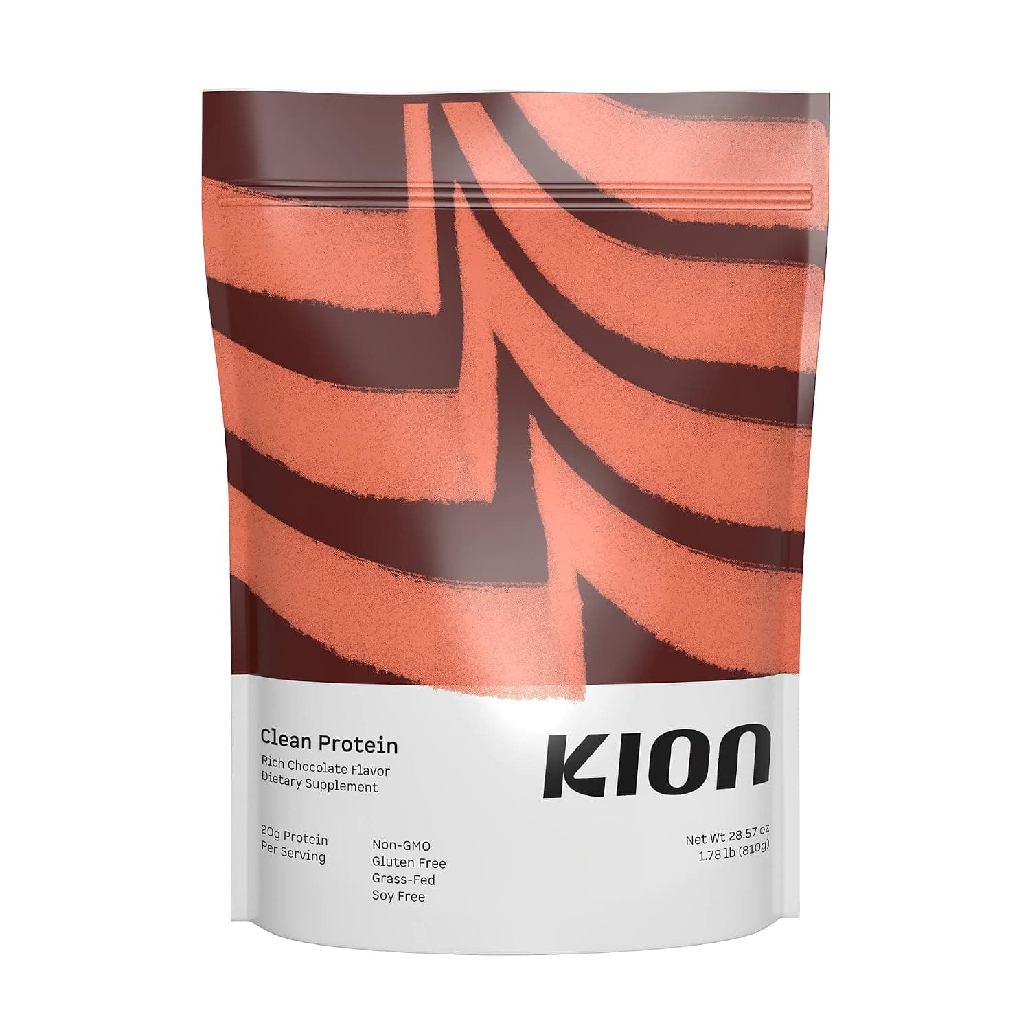
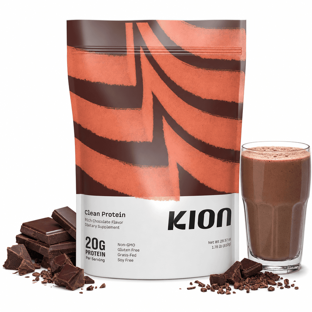
This is the size the click decision gets made at. One of these tells you the protein count, the flavor, and what the shake looks like. The other tells you the brand name.
The shelf math
The read is not opinion. Every winning main on this shelf was decomposed into its elements; the rebuild follows the adoption data.
The three moves
Promote the hero number
Build the flavor world
Stage the scene
What the rebuild does not do
It does not invent a claim, add a badge the brand has not earned, or repaint the pack. The 20G was already printed on the label; the rebuild promotes it. The chocolate is the flavor on the front of the bag. Everything asserted in Exhibit B is something Kion already owns. It also does not pretend 20g is a category-leading dose. It is mid-pack on this shelf, where the isolate leaders print 24 to 25. The argument here is legibility, not superiority.
A full shelf audit runs this same read on your listing and hands you a prioritized fix stack, not a checklist.
Request an audit →one shelf · one report · turnaround in 5 days